BUSCH LIGHT TAP Handle
Anheuser-Busch had asked our studio to help revitalize their tap handle & showcase their branding better. The final design had to stand out against other options on tap. I had the opportunity to be the primary designer for this project.
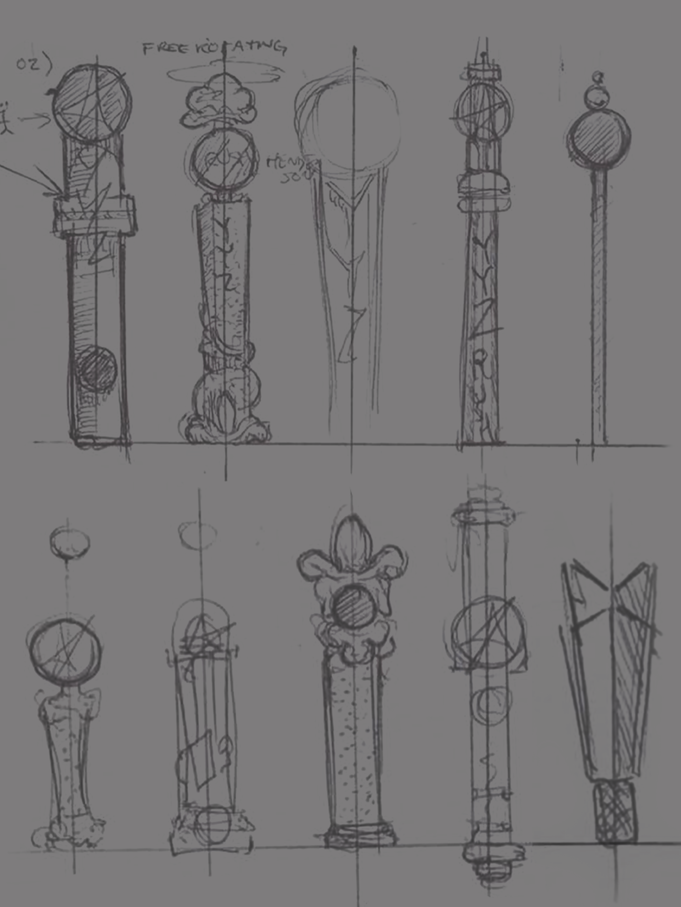
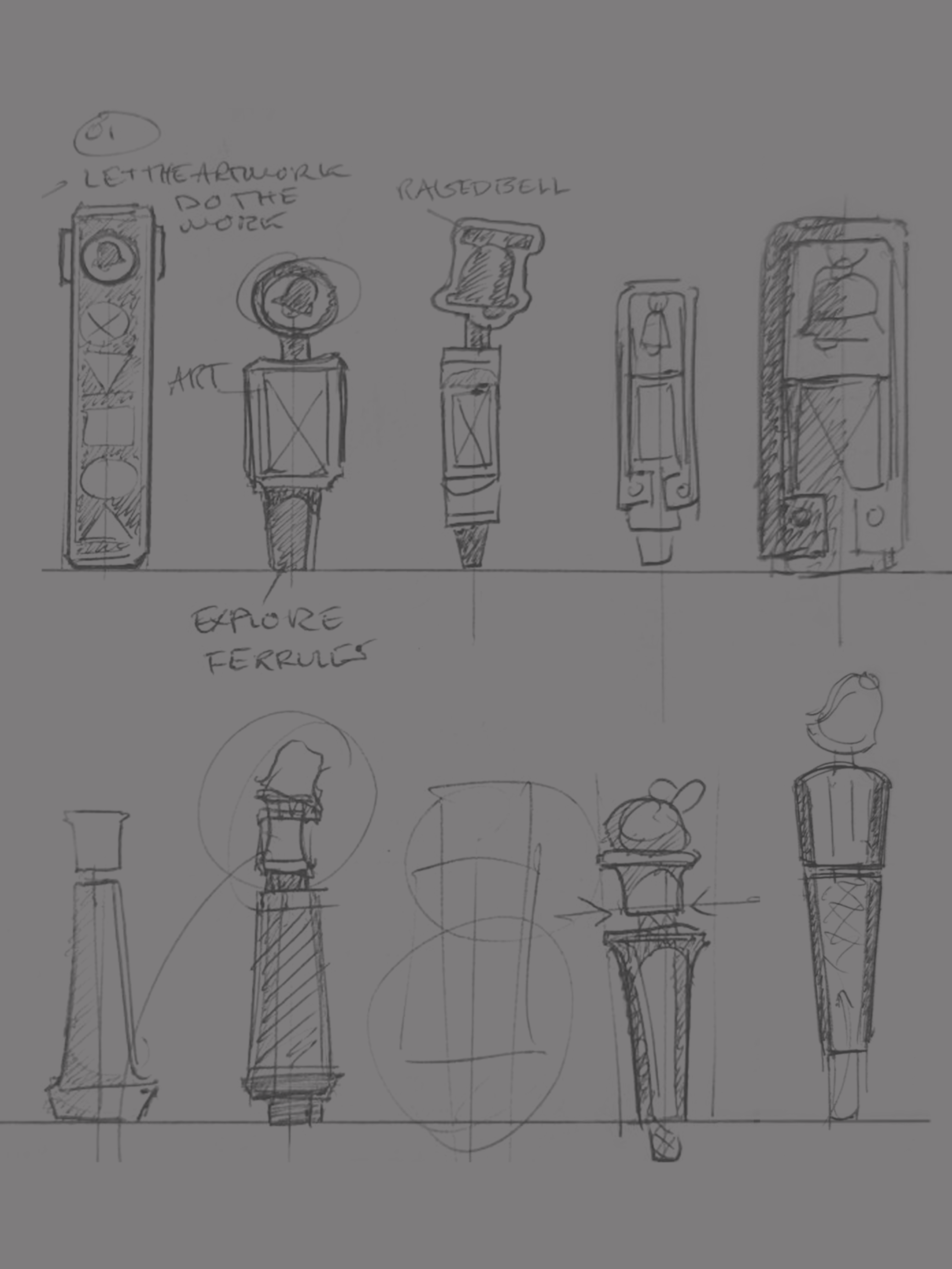
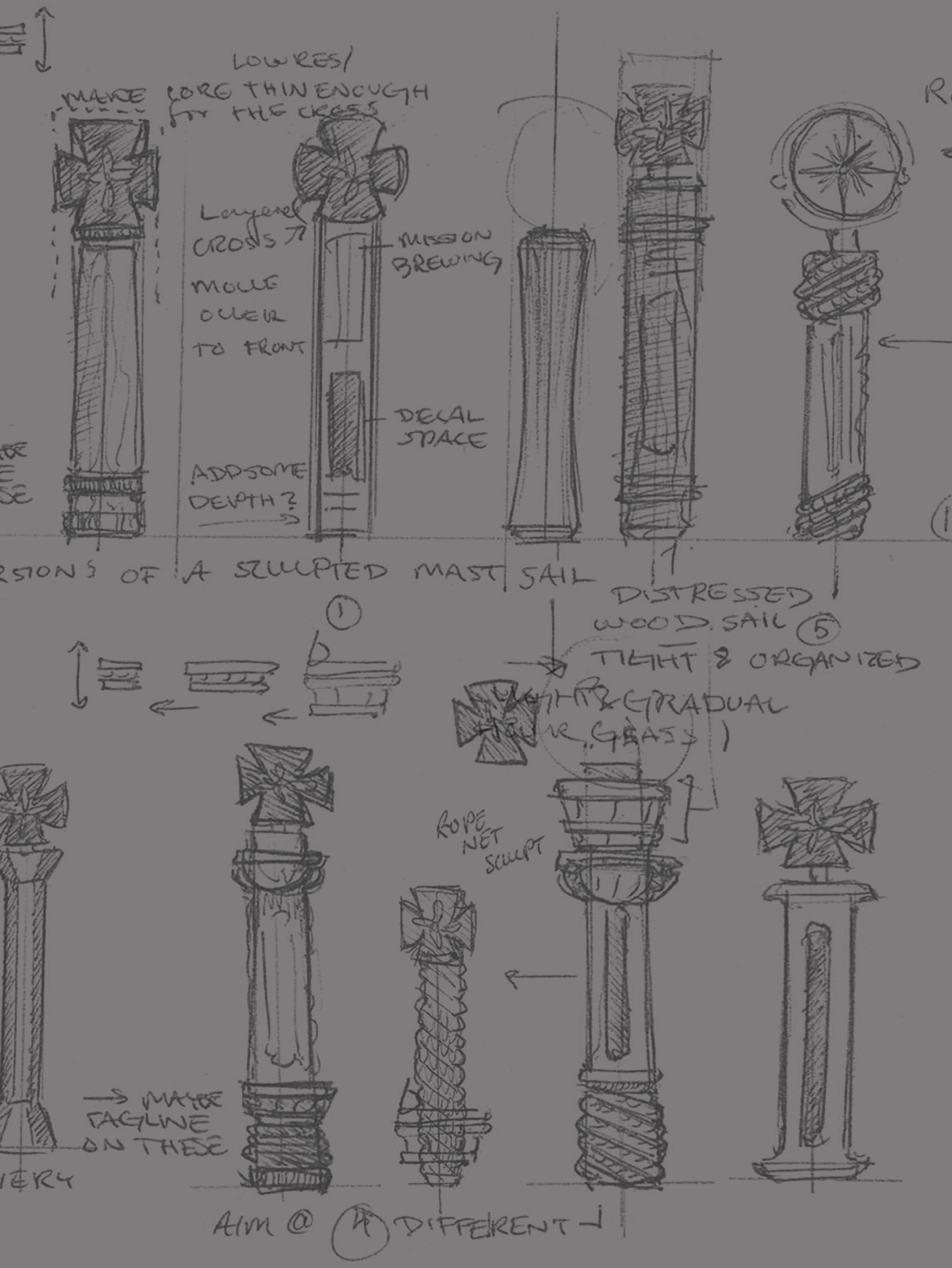
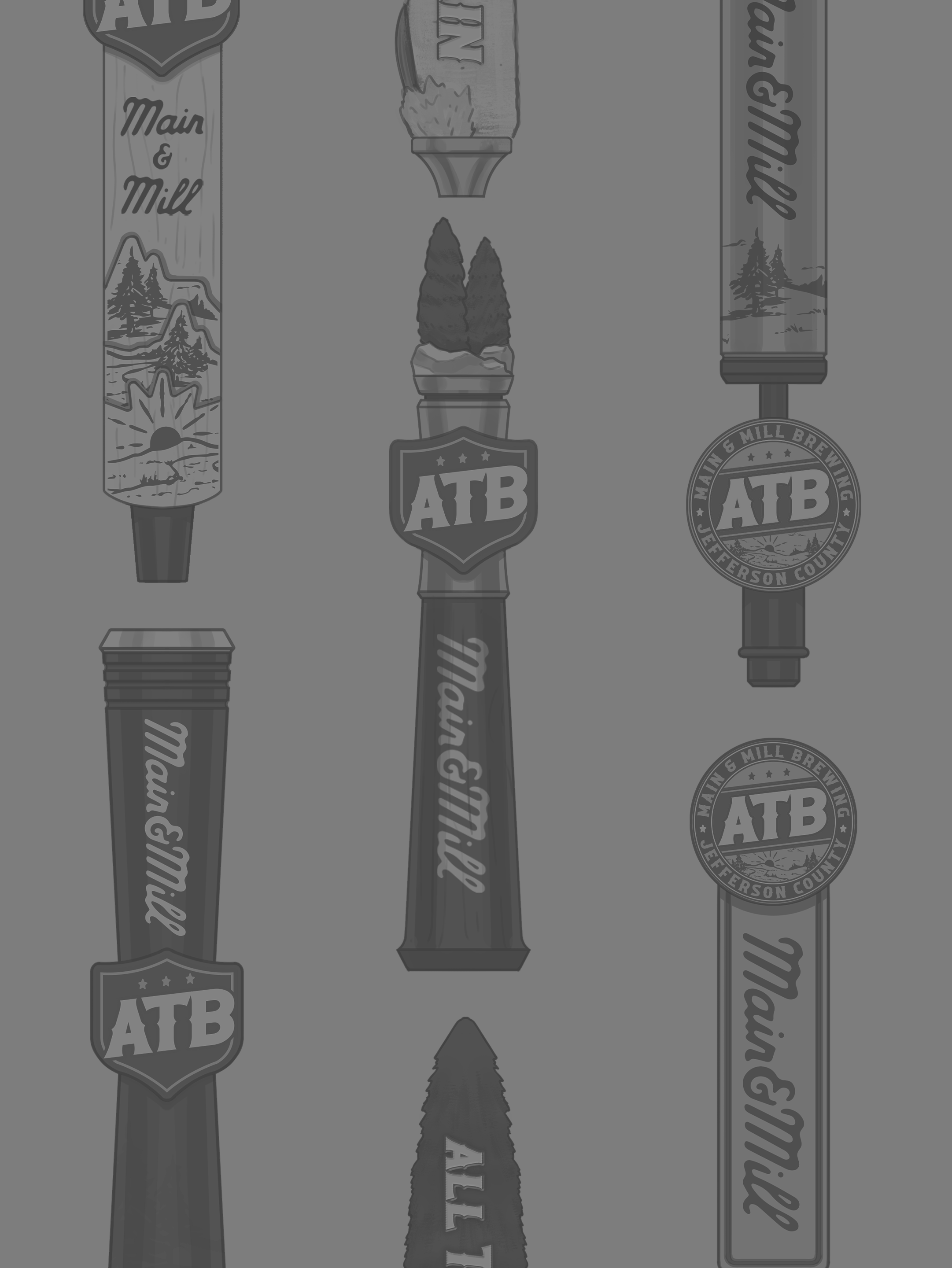
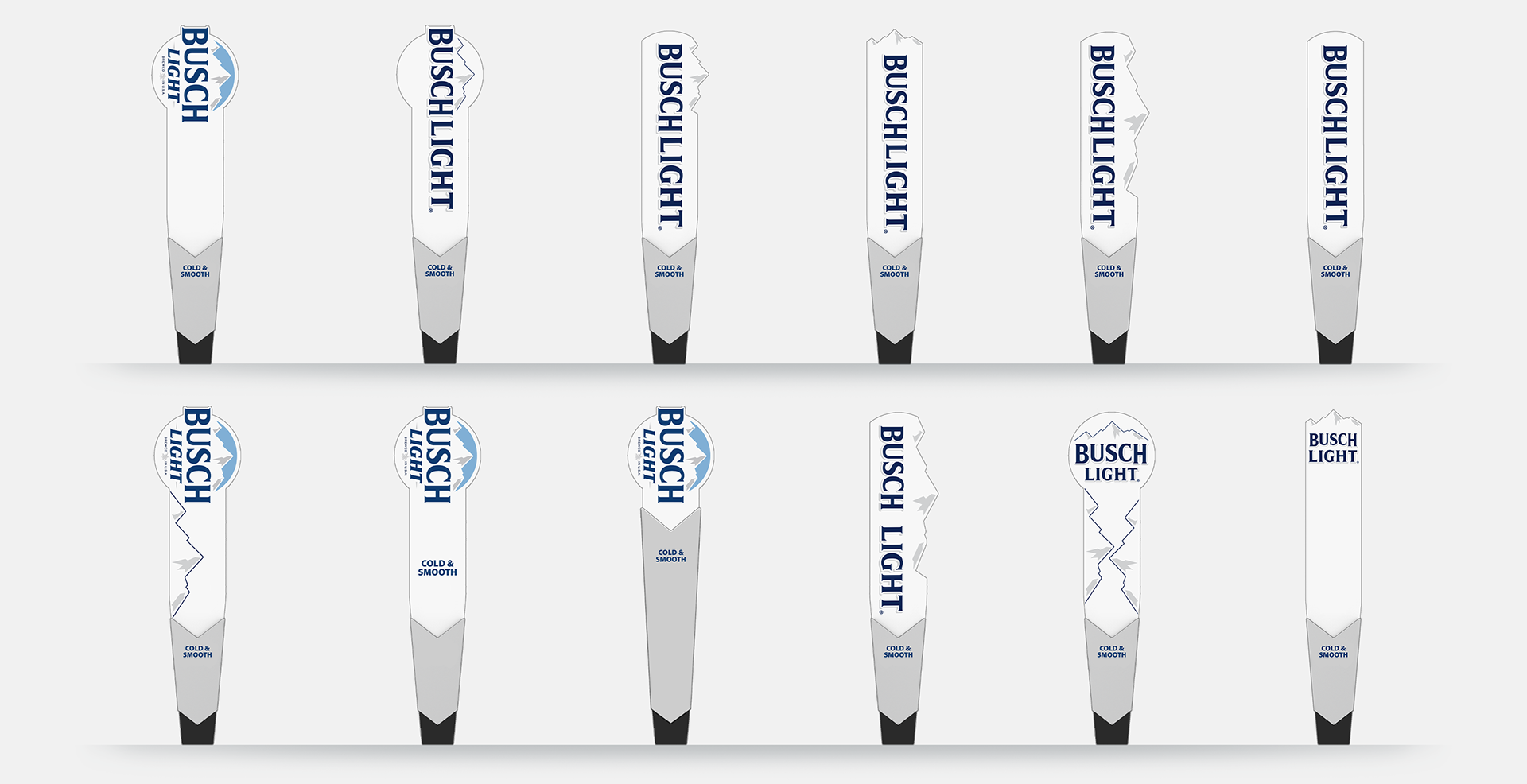
01 - ideation
For the first few rounds we were exhausting every possible way for their branding to fit on a handle similar to their previous one. They knew they wanted the full word mark "Busch Light" incorporated.
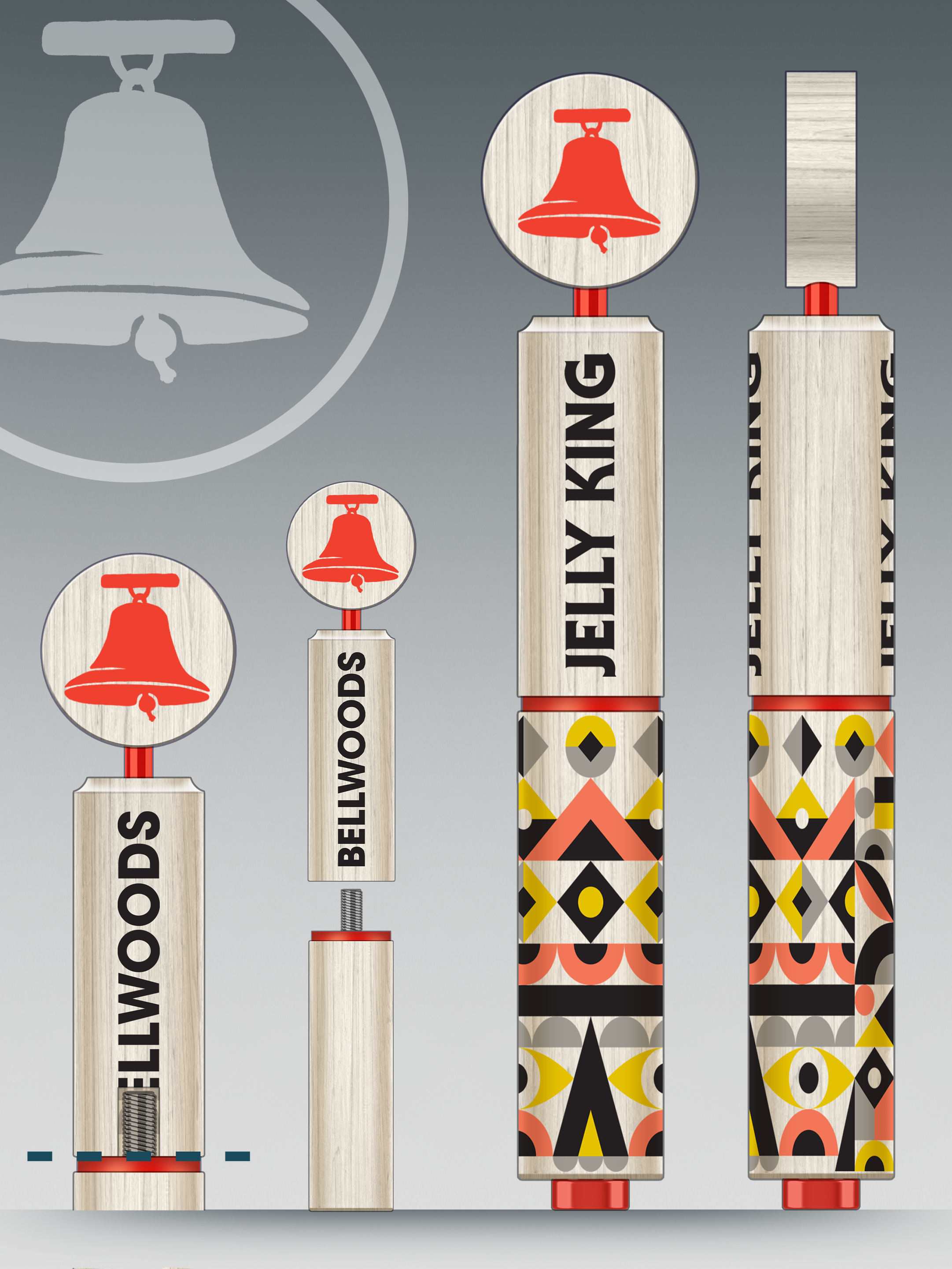
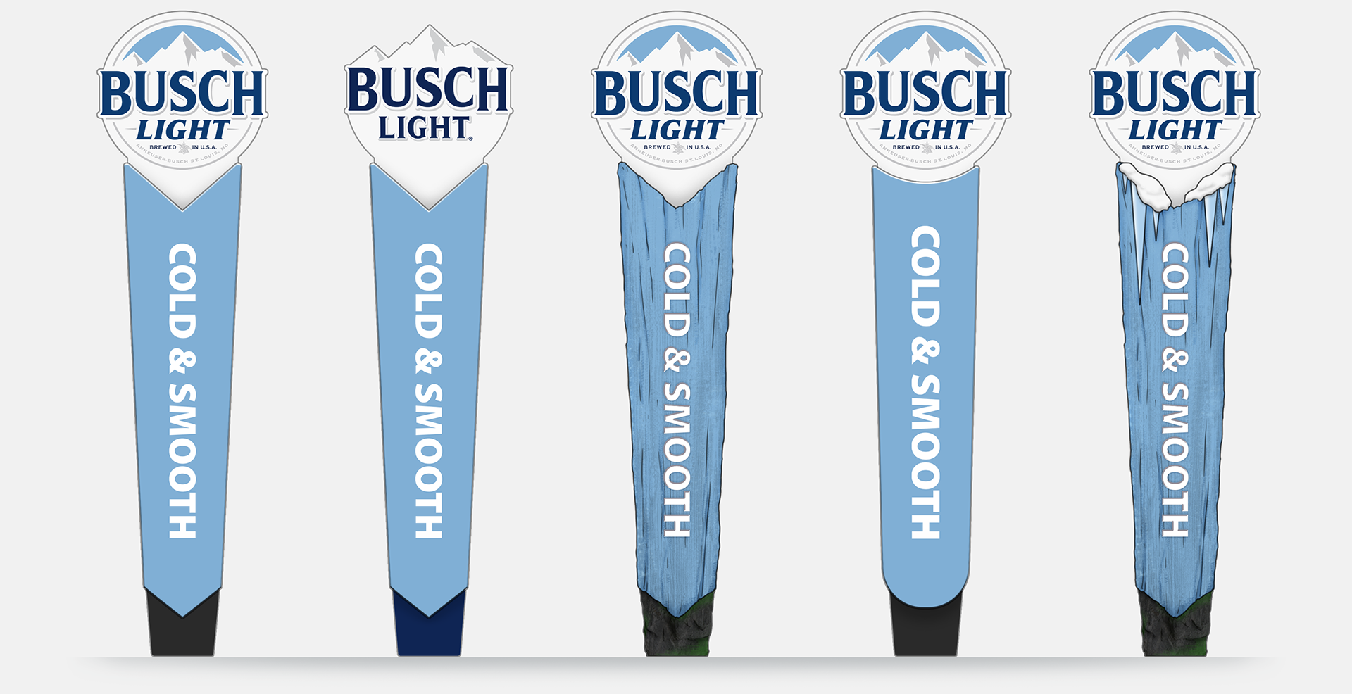
02 - Refinement
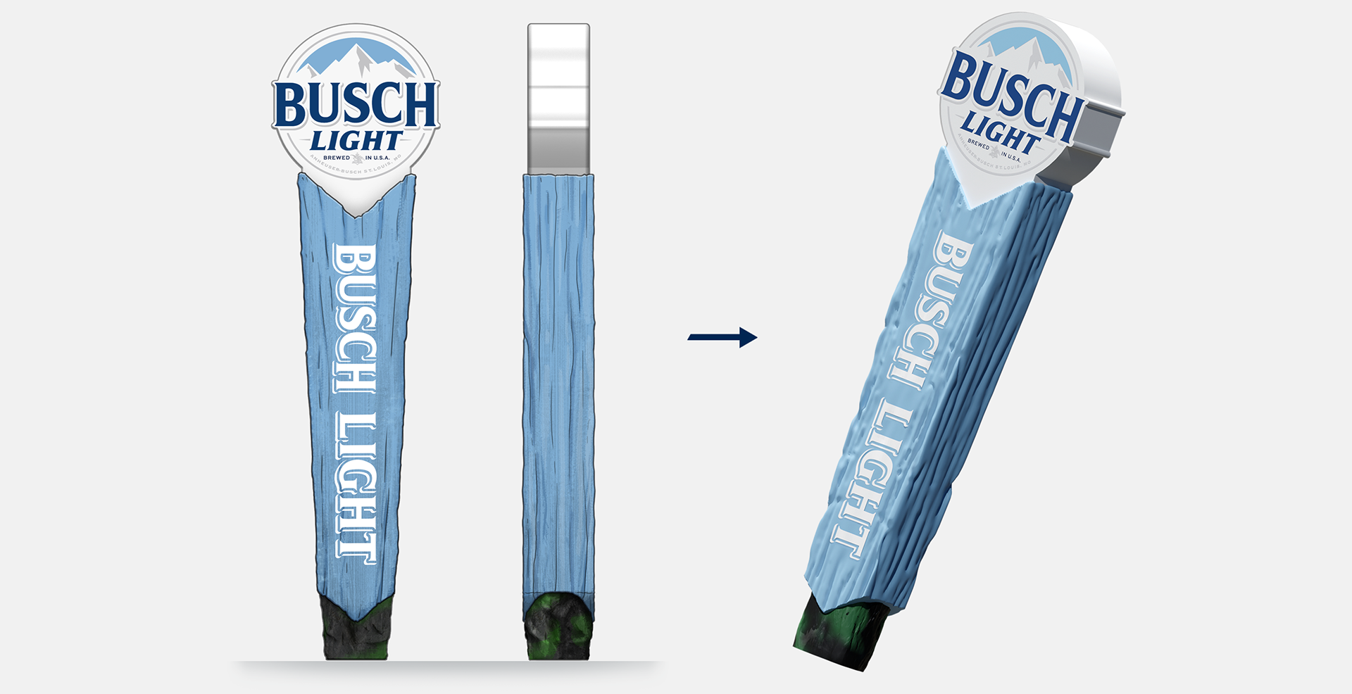
After they were familiar with what their branding was able to achieve on their previous handle, I took the opportunity to show some unprompted approaches to the nature & outdoorsy aspects of Busch Light. Bringing in elements of wood & stone textures helped get the idea across that you might find this tap handle in the middle of nature.
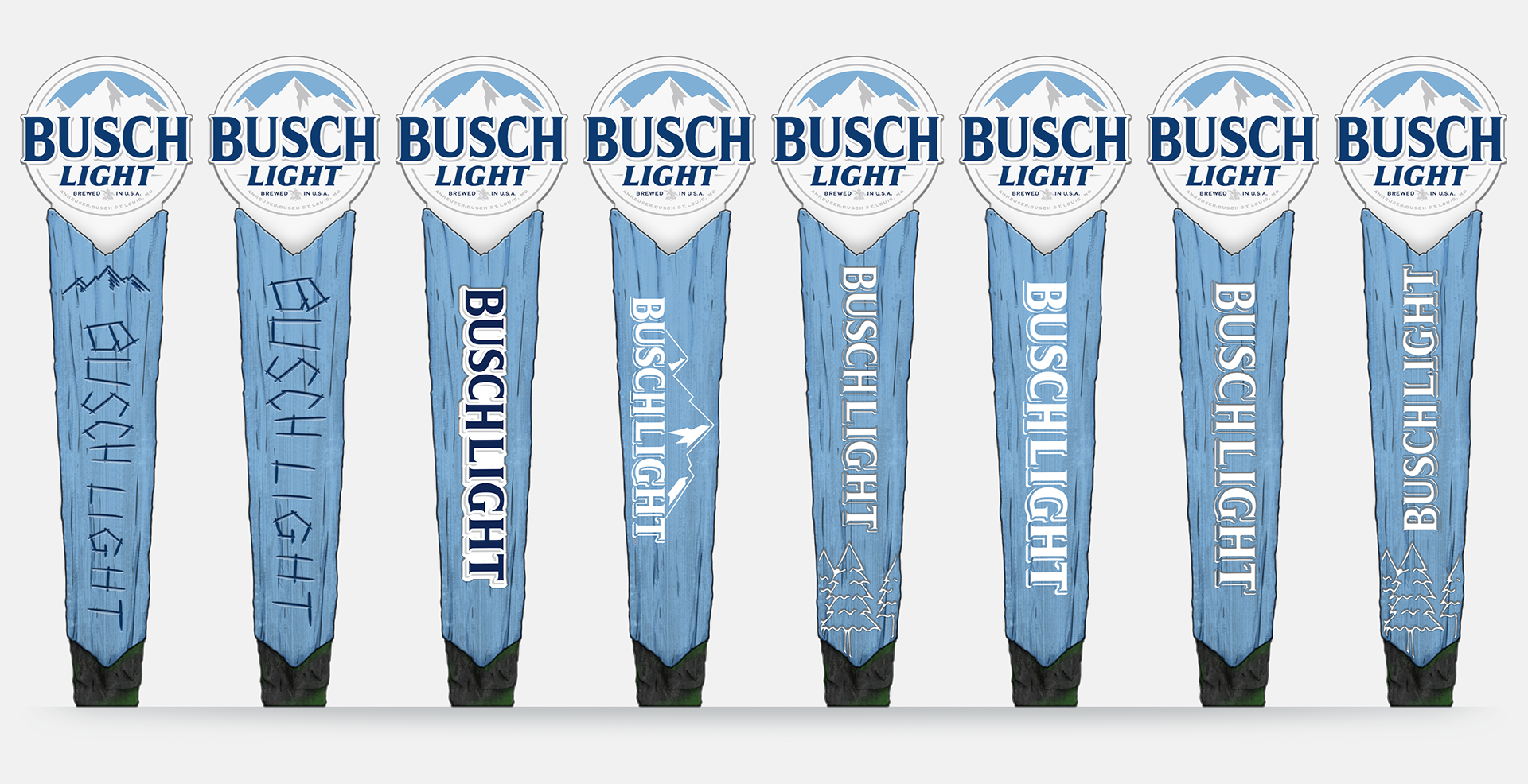
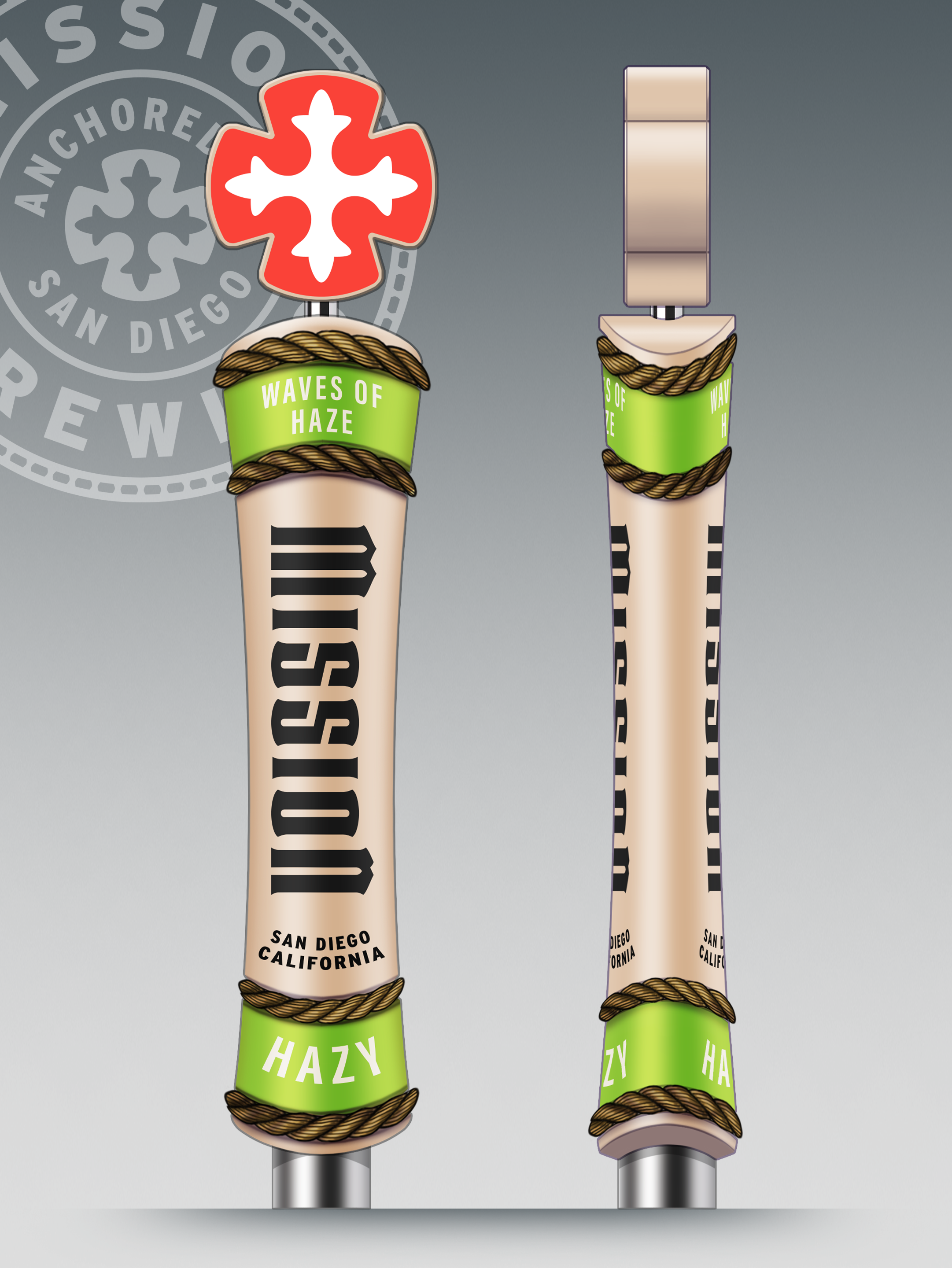
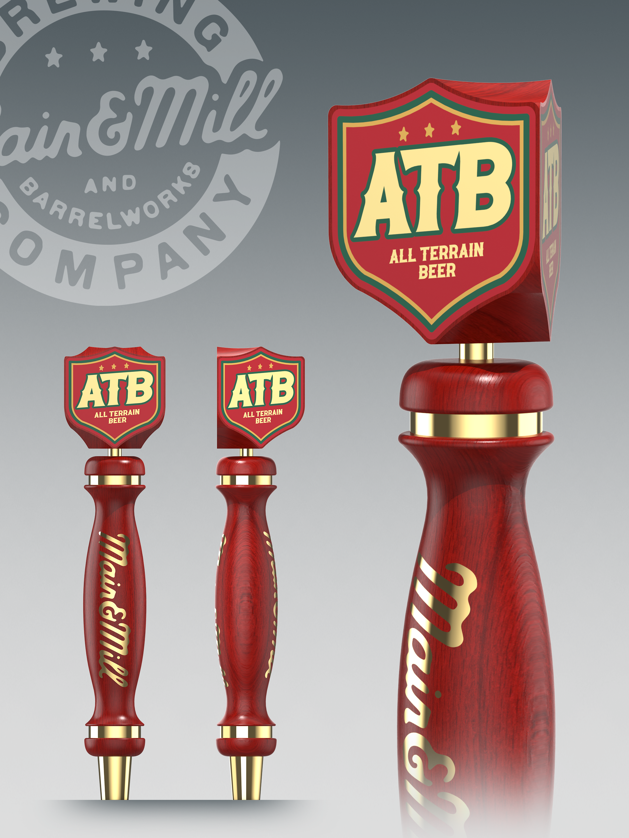
03 - final design
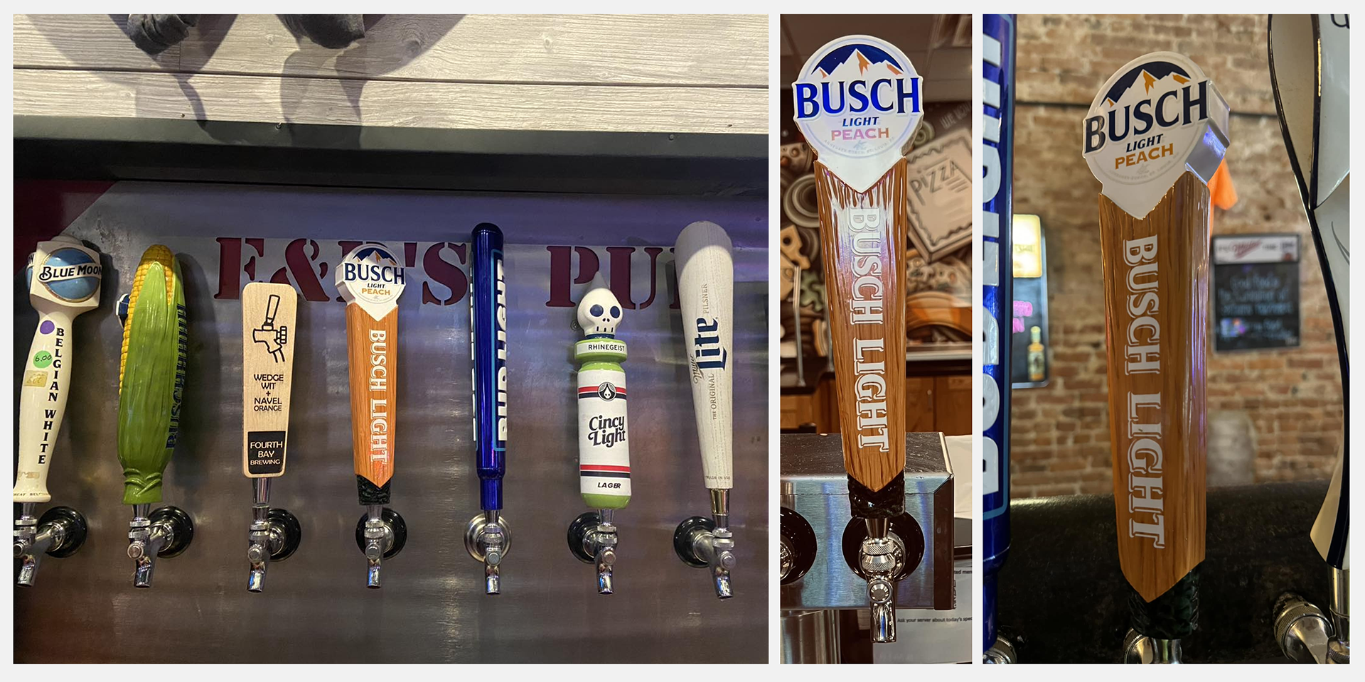
Once they fell in love with the wood & stone design elements they requested artwork exploration to make sure they knew what they wanted - leading to the final design below. This handle also has been the basis of their future line-up of flavors & brews.