Mission Brewing reached out to our studio in April of 2023, requesting a revamp of their tap handle lineup. They knew they wanted to use the same shape across their brand, while changing the colors & text to show distinction. We focused on their "Waves of Haze" flavor, as a place holder.
01 - ideation
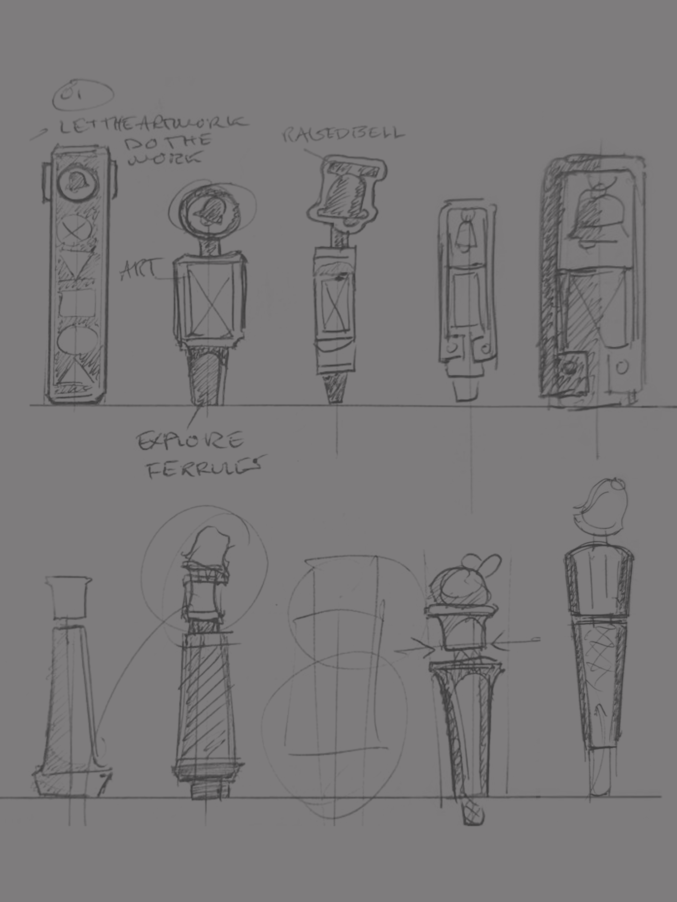
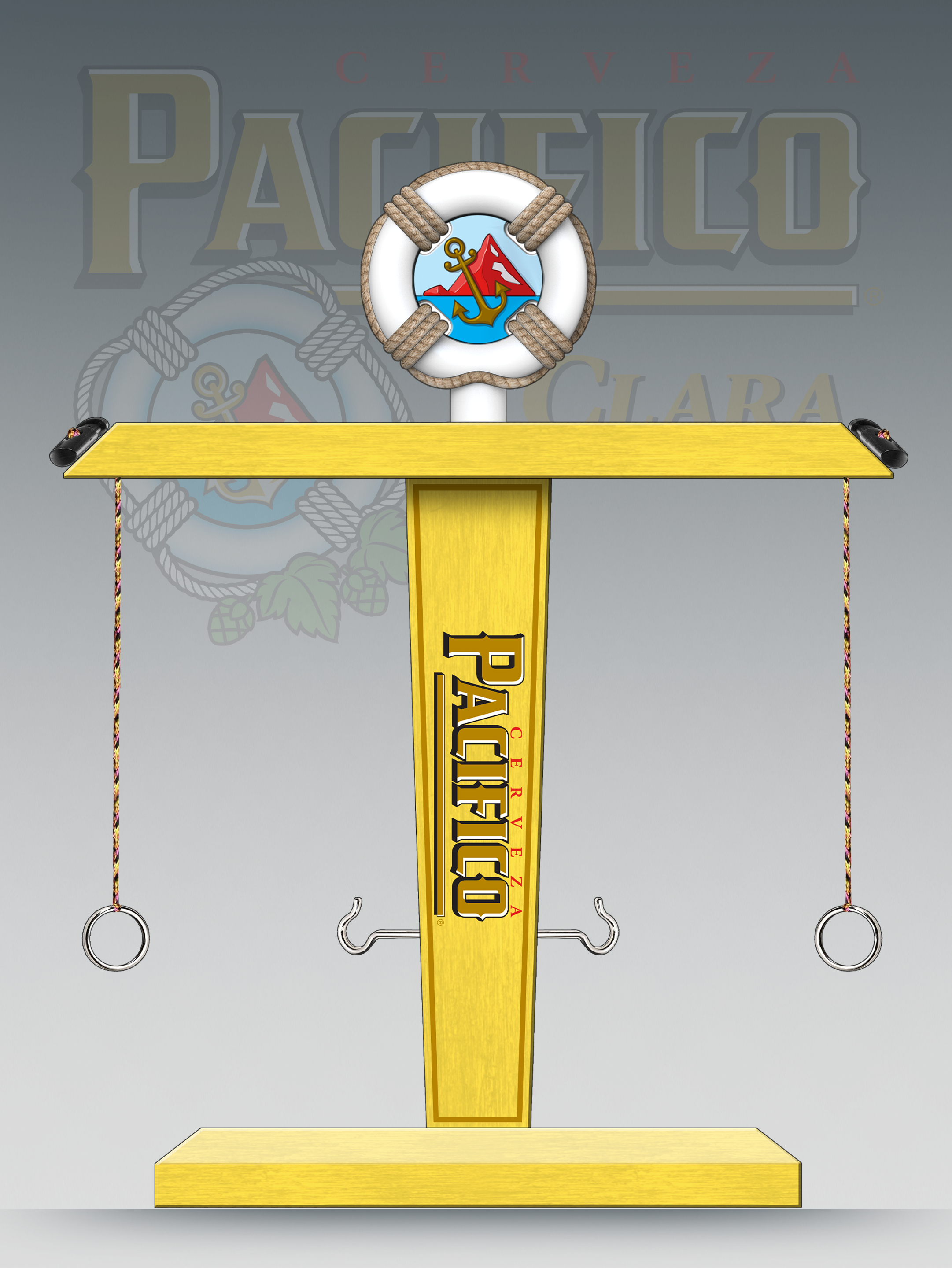
Mission Brewing's branding focuses heavily on nautical themes. In previous handles they aimed more towards Spanish missionary/explorer aesthetics, but decided to narrow in on their nautical adventure angle. Below are the thumbnails & sketches of seeing how their branding can fit on an obvious nautical handle:
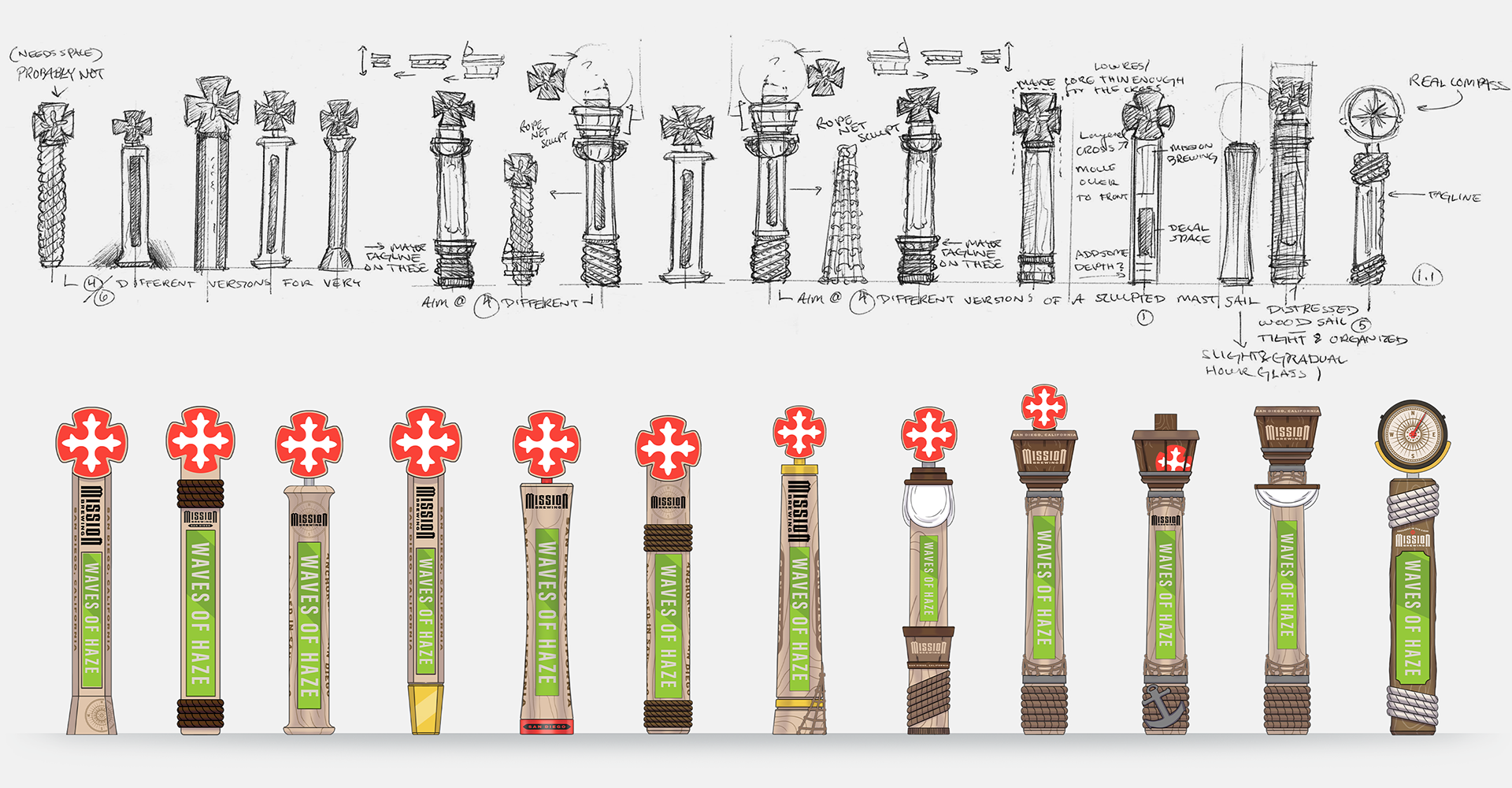
02 - Refinement
The rope & tan elements really caught their attention the first few design rounds. They ultimately decided that the best way to differentiate flavors is to paint handles different colors in designated areas. More forms were expanded upon to maximize the amount of branding that could be read legibly.
03 - final design
From the previous round I widened the colored spaces to be able to include a larger artwork application. Following that, the rest of the brands of their lineup could be included & ordred:
